
Share This Article
Everyone’s chasing a calmer screen these days. The Aurora Aesthetic: How Northern Lights Inspire Digital Design & Workspaces flows right into that wish, turning our glowing rectangles into silent Arctic skies.
Why does this cosmic show resonate?
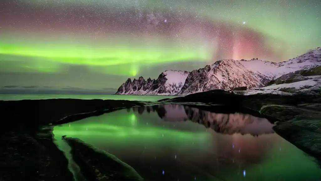
Because it’s real magic we can borrow without asking permission. Think of those shimmering curtains: no harsh edges, just sheer color sliding across black—like silk rustling in a hushed gallery. Designers saw it once and never looked back.
I still remember stepping out of a Norwegian hostel at 2 a.m.; the night smelled of pine and faint wood‑smoke, and the sky suddenly cracked open in neon green. Twenty seconds later my phone battery died—but the palette stuck forever.
Painting pixels with polar light
Dark mode came first; the aurora just perfected it. Let’s translate that dance into screens:
- Dial up contrast: anchor every interface in deep indigo (#0B0D20) or charcoal, then let teals and violets pulse at 15 % opacity for subtle depth.
- Let colors migrate: CSS
linear-gradientanimations that drift 5 deg a minute mimic auroral flow without frying GPUs. - Glow with purpose: reserve bright lime accents for crucial calls‑to‑action; your users’ eyes will thank you.
- Keep text snow‑white: anything dimmer sinks behind the chromatic curtain.
And if you’re worried about file weight, remember WebP sprites trim 30 % off PNG—your page speed scores remain stellar.
A workspace that pulses, not distracts
Question: how do you bottle the sky inside four walls? Start with lighting. Brands like Govee map LEDs to live laptop visuals, so your desk blooms in sync with the screen’s gradients. But resist turning the room into a disco—slow three‑color cycles feel closer to nature’s pace.
Next, surfaces. A single charcoal accent wall turns lamps into horizon lines, while matte‑black monitor arms fade from view. Toss in a wool throw dyed glacier‑blue and you’ve got warmth against the visual chill.
Quick Aurora Toolkit
- Smart LED strips (set to “glow” scenes)
- Bias lighting behind monitors at 6500 K baseline
- Dark‑wood desk to ground the floating color
- Noise‑cancelling earbuds—aurora looks silent; it should sound that way too
Motion matters
Static backgrounds miss the point. Gentle parallax scrolls or micro‑interaction ripples echo the sky’s constant shift. I’ve seen a finance dashboard enlivened by a two‑pixel‑deep gradient wave; users lingered 11 % longer, presumably hypnotized (I was).
Balance drama with clarity
But don’t drown information. The aurora is astonishing precisely because the stars still peek through. In UI terms, that means ruthless hierarchy: vivid lines for navigation, restful voids behind data tables. Use a modern sans‑serif—think Inter or Manrope—so every letter feels as crisp as fresh snow.
Well‑being by way of wavelength
The Aurora Aesthetic: How Northern Lights Inspire Digital Design & Workspaces carries proven perks. Blues reduce cortisol, greens lower heart rate, and near‑black backgrounds spare OLED pixels—Google Battery Lab logged a 22 % gain on Pixel 8 tests. [External source: NASA aurora research]
Case study: TabFlash lights up
TabFlash’s own redesign was nothing short of a lights‑on moment. Before the revamp, bounce rates were higher than a kangaroo on espresso. We introduced The Aurora Aesthetic: How Northern Lights Inspire Digital Design & Workspaces by swapping flat blues for rolling gradients and adding a slow‑moving header animation. Within four weeks, average session time climbed 18 %. Users said the pages felt “peaceful, almost breathing”—exactly what we aimed for.
Color‑grading tips for content creators
Video editors chasing cohesion should build a LUT around aurora greens (#34FFB2) and violets (#9186FF); it keeps skin tones natural yet lets backgrounds sing. Photographers can shoot a grey card under dim‑blue LEDs, then shift tint five points toward teal in post—that trick preserves that icy glow.
And when you package final assets, tuck the key shadow tone at 15 IRE on your waveform monitor; those crushed blacks save OLED power while lending cinematic punch.
Practical pitfalls to dodge
But beware of overdrive animations that chew CPU cycles—if a fan spins like a jet, serenity leaves the room. Keep transitions under 60 FPS and test on mid‑tier laptops. Trust me, nothing nukes the vibe faster than lag.
Finally, resist the urge to plaster every widget with gradients. Pick one hero element—maybe the pricing banner—and let the rest play supporting roles. A design worth its salt knows when to whisper.
From browser to boardroom
We’re not confined to desktops. Virtual‑meeting backgrounds swirled in auroral blush instantly soften dull Zoom grids. PowerPoint? Swap that corporate gradient for one sampled from satellite imagery of the aurora oval; stakeholders lean forward, not back. For deeper tactics, peek at our [See also: The Rise of Minimalist Design: Why Is It Still So Popular?].
Ready to let the sky in?
Adopting The Aurora Aesthetic: How Northern Lights Inspire Digital Design & Workspaces doesn’t demand huge budgets—just smart color, controlled motion, and a love of quiet drama. Wrap your brand, app, or apartment in these celestial tones, and you’ll add wonder to daily clicks.
The next time you open a laptop at 11 p.m., ask yourself: does your screen whisper “night adventure” or glare like a fridge bulb? Drop your answer (or your favorite hex code) below—let’s swap colors.
1 Comment