
Share This Article
The web never sits still, and neither should we. Hot Web Design Trends for 2025‑2026: Innovations Shaping User Experience sets the scene, but the real story unfolds in the details—those subtle choices that make a visitor pause, smile, and click again. Let’s dive into the ideas likely to steer modern sites for the next two years, keeping jargon light and clarity high.
Why Future‑Ready Design Still Matters
Think back to the last sluggish, ad‑heavy homepage you stumbled upon. Remember the frustration—the impatient tap of your finger, the whirring laptop fan? When a page drags, users vanish. Staying current is less about chasing fads and more about trimming friction so content shines. Search engines reward that discipline with higher rankings, and readers repay it with loyalty.
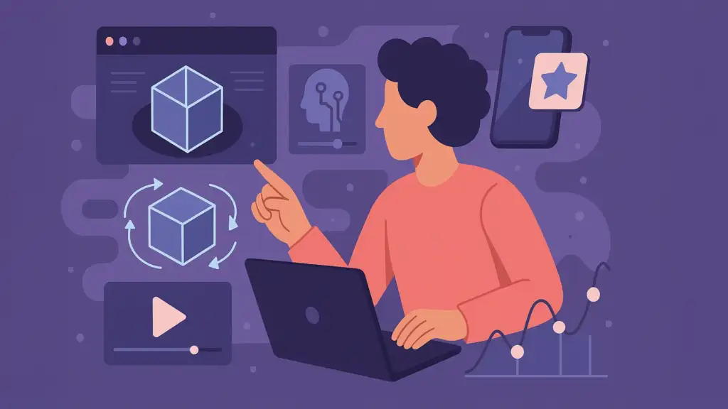
1. AI‑Driven Personalization
Machine learning has moved from novelty to necessity. By late 2026, design copilots will quietly reshape everything from color palettes to product order.
- Contextual layouts: Algorithms study real‑time behavior—scroll depth, cursor pauses—and rearrange blocks accordingly.
- Smart micro‑copy: Headlines adjust tone for returning vs. first‑time visitors, boosting relevance without manual edits.
- Predictive suggestions: If a user lingers on hiking boots, AI nudges them toward matching socks before they even search.
Micro‑anecdote: I once watched an AI prototype swap a site’s hero image after noticing most visitors arrived from a rainy region. Conversions climbed 14 % overnight—no human had guessed weather mattered.
Serve a clean HTML skeleton first so crawlers capture core content, then layer dynamic pieces. That balance keeps both bots and people happy. [External source: Leading AI Design Report]
2. Immersive Layers: 3D, AR & Browser‑Based VR
Flat screens can now feel almost tactile. Interactive product models let shoppers spin a sneaker, peel away materials, and view sole traction up close. Augmented‑reality previews pop a sofa into a living room with a satisfying thunk of spatial audio. Even WebVR campus tours are loading straight in browsers—no headset app required.
Designers should compress textures, lazy‑load background scenes, and preload only the first camera angle. Performance stays snappy; users stay present.
3. Thoughtful Microinteractions & Motion
A tiny hover shadow might seem trivial until it reassures a visitor that a button actually works. Well‑timed motion directs the eye, reduces cognitive load, and sprinkles delight along the path.
- Guide focus with staggered card reveals instead of massive hero sliders.
- Confirm actions using subtle haptic‑style bumps (a quick shade shift works wonders).
- Build personality through bespoke loaders: a swirling brand icon beats a generic spinner any day.
Still, respect accessibility. Provide a prefers‑reduced‑motion fallback so animations pause for sensitive users.
4. Expressive Fonts & Kinetic Typography
Variable fonts bundle multiple weights, widths, and slants into one compact file—goodbye kilobyte bloat. Designers now stretch headlines gently on scroll or let letters ripple when a cursor drifts by. The effect feels almost like ink spreading across paper.
Keep semantic tags intact and text selectable. That way screen readers, translators, and search bots all catch the message.
5. Sustainability & Performance Hand‑in‑Hand
Eco‑friendly practices dovetail perfectly with speed. Hosting on renewable‑powered servers lowers carbon footprints while shaving milliseconds off time‑to‑first‑byte. Serving WebP or AVIF images trims file sizes by up to half. Deferring non‑critical scripts lets meaningful content paint first, reducing both energy drain and bounce rates.
Quick Wins Checklist
– Audit unused JavaScript weekly. – Convert icons to SVG; supply dark‑mode styles. – Test full keyboard navigation, including modal dialogs. – Rename images descriptively for SEO and screen readers. – Offer motion‑safe mode via media queries.
6. Voice Interfaces Meet Data Storytelling
Typing is giving way to asking. Sites optimized for conversational queries answer the who, what, and why in language that feels human, not robotic. Add structured data, and smart speakers happily quote your snippet.
Pair that with scrollytelling dashboards. As users swipe, charts morph: bars lengthen, lines glow, tooltips whisper context. The result? Complex data turns into an engaging story readers can almost hear rustling like pages in a magazine.
7. Minimalism 2.0: Raw Yet Refined
Minimalist doesn’t equal sterile. Neo‑brutal color blocks, exposed grids, and generous whitespace create clarity without banishing warmth. Start by stripping every element that lacks purpose, then emphasise the crucial call‑to‑action so nothing competes for attention.
But minimal layouts still demand solid hierarchy—contrast, repetition, and alignment—to avoid looking like an unfinished wireframe.
8. Modular Builds: Composable Architecture & Headless CMS
Decoupling frontend and backend frees teams to innovate rapidly. Frameworks such as Next.js or Astro prerender pages for lightning‑fast delivery, while headless CMS feeds content through APIs to web, mobile, or even a smartwatch without duplicate entry.
The payoff: easier A/B tests, painless redesigns, and near‑instant global scaling when a post goes viral.
9. Accessibility (A11y) Stays Non‑Negotiable
Inclusive practices are now table stakes. High color contrast ratios aid low‑vision users; logical heading order helps screen readers; keyboard paths ensure interactive charts remain usable. Build these features from day one and you’ll save costly retrofits later.
10. Interactive Data Visualizations
Static charts bore; interactive ones educate. Let visitors filter a dataset, pinch‑zoom outliers, or toggle timelines. Leverage responsive SVG or canvas so visuals stay crisp from phone to ultrawide monitor. Remember to include alt text describing trends depicted—search engines and visually impaired readers will thank you.
Modern web design isn’t about cramming every shiny feature onto a page. It’s about selecting the innovations that align with your brand’s goals and your audience’s needs. Will you explore AI‑guided layouts first, or test an AR product demo? Drop a comment and tell us where you’re heading.
[See also: Taming Your Desktop Chaos: A Step-by-Step Organization Guide (Windows & Mac)]
1 Comment